Behind the scenes: Space

This is part 4/7 of a series of articles written by Eve, the Clever Endeavour Community Manager, about the making of the A-cobra-tic Update for Ultimate Chicken Horse, which was released in March 2020. Each article reveals some of the process of making new content for the game, and shows in-progress images of each of the A-cobra-tic features that have never been shown to the public before.


Making a very spacious level

As you can probably tell from the previous articles on the flamethrower, Snake, and the cannon, we often get inspired by community suggestions and fan art when we set out to make new content for Ultimate Chicken Horse.

One of the things we wanted to do with the A-cobra-tic Update was to take inspiration from some of the most popular user-made Party levels in the game, and turn one of those proven concepts or layouts into an official and upgraded version in the Treehouse. It seemed like a good way to pay tribute to our amazingly creative community of level editors, while also finding level ideas that did not depend on a gimmick that would require lots of iterations and testing.

The theme we saw most often was outer space. This has been requested frequently since at least November 2016, as shown in this concept art posted by SlapTheSam on Steam:

“Sheep waz here”

“Sheep waz here”


The requests for a space-themed level became even more frequent when we introduced the Low Gravity Modifier with the Transformidable Update, and many players made their own versions in the in-game level editor.

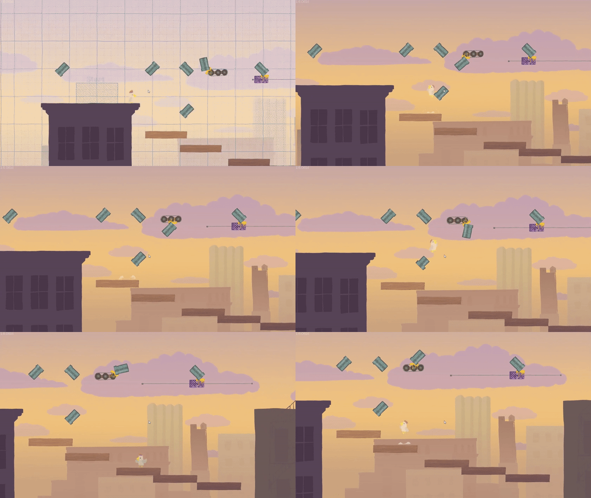
One that was especially beloved by the player community was Brontalo’s ‘Asteroid Belt’ (4M65-T4KU), which combines low gravity and jetpacks for extra floatiness.

this should look quite familiar

this should look quite familiar


We thought it would be interesting to make a vertical space level like this, with obstacles between the start and the flag. However, there were a few things we wanted to do differently.

First of all, we absolutely did not want to have a dark background like the one from the in-game level editor, because it makes for abysmal readability of some of the hazards – mostly the black hole and hockey puck. We know some players love to make custom levels that use this as a gimmick, but we knew better than to create another Dance Party situation. (I might also have a personal grudge with the Free Play starry background after playing so many levels for featuring, and may never forgive Kyler for making it a thing in the first place. But that’s a different story.)

hello darkness my old friend~

hello darkness my old friend~


Second, we agreed not to force the Low Gravity (or Jetpack) Modifier, because it would have negated or complicated player choice when setting custom Modifiers in this level. That meant that we had to find other ways of making the vertical climb feel natural and not too cumbersome in our space level.

We solved the latter concern with something Ben had wanted to introduce to Ultimate Chicken Horse for a long time: a UFO. Its tractor beam, which is in fact a giant black hole (the circle in the image below) with a cone-like area of effect, pulls players upwards with increasing force – and conveniently kills them if they get abducted before touching the flag.

thE green lines are called wireframes. they reveal colliders and the likes

thE green lines are called wireframes. they reveal colliders and the likes


The tractor beam definitely made Space a “gimmicky” level, which we originally wanted to avoid for fear of introducing countless technical considerations and edge cases. However, because we were reusing code from the black hole, which has been in the game for a long time, there was very little risk of encountering major bugs that we hadn’t already fixed in the past. Indeed, we didn’t have too much trouble making the level work mechanically, and spent more time on other aspects of it.

As for the background, we took inspiration from colorized pictures of nebulae, with their pretty pink and teal hues, to create a form of “atmospheric gradient” from the bottom to the top that would look spacey without being too dark. To make the gradient as smooth as possible, we applied it via a couple of layers in Unity, rather than painting it straight onto the background itself.

The last stylistic touch was to make the asteroid belt into flaming tennis balls, because Fabio had this idea of a space tennis court from which the Doomsday Meteors originate.

we’re pretty committed to the bit at this point

we’re pretty committed to the bit at this point


One final change we made to the original level concept by Brontalo was to make ours quite a bit shorter. After testing a taller version among ourselves, we found that it was too difficult and tiresome to climb to the UFO when it was placed significantly higher, and the extra distance didn’t really add anything to the gameplay. Reducing how much it stretched vertically also helped avoid situations where the camera zoomed out too much, making the borders of the level extremely apparent and complicating visibility for players.

the final space level, all zoomed out

the final space level, all zoomed out


We started our work on Space simply wanting to recreate and iterate on a fan favorite among existing user-made levels. In the end, we actually went pretty hard on level-defining mechanical gimmick to make the vertical climb work by adding the UFO and its tractor beam, in addition to changing the proportions of the playing field.

By taking inspiration from the community yet not hesitating to use all our arsenal to upscale the idea, we feel like we made Space into one of our most unique levels to date. We certainly hope that Brontalo and everyone who suggested that we make a space-themed level also feel like we did justice to the concept!

If you liked this behind-the-scenes article, we suggest that you check out the previous ones on the flamethrower, Snake, and cannon. Stay tuned for next week’s installment: we will reveal the making of the one-way gate!

Behind the scenes: The cannon

This is part 3/7 of a series of articles written by Eve, the Clever Endeavour Community Manager, about the making of the A-cobra-tic Update for Ultimate Chicken Horse, which was released in March 2020. Each article reveals some of the process of making new content for the game, and shows in-progress images of each of the A-cobra-tic features that have never been shown to the public before.


Jump in to learn about the cannon

Similarly to the flamethrower’s diagonal hazard, the A-cobra-tic cannon’s design was motivated by our desire to add a diagonal “mover” type of block to Ultimate Chicken Horse, as a counterpart to the fan, which pushes you in a cardinal direction.

The thought of a barrel cannon à la Donkey Kong Country was what we all initially had in mind, because it’s a game mechanic that has been proven to be objectively cool. Nevertheless, we had an early period of doubt about the feasibility of it.

When we imagined a DK-like cannon, we pictured it holding characters and moving along a track or swinging back and forth in an arc, until the player pressed the jump button to shoot out of it. However, we soon agreed that we didn’t want to introduce an item that required that kind of input, since it’s unlike any other mechanic in Ultimate Chicken Horse, and could easily lead to confusion.

I grew up here

I grew up here


We also feared that we would need to spend too much time making the physics and animations work for multiple players using a cannon in short succession, and had major concerns about networking everything properly for online games. Because we wanted this update to be completed relatively quickly, those factors almost scared us away from making a cannon altogether.

Instead, the team agreed to prototype an item that was more like a boost pad. We wanted something that you didn’t need to enter and then voluntarily exit. Instead, you’d simply be pushed in one direction when traversing the block’s area, as if you had moved into a fan’s wind, except the effect was diagonal and there was no solid object preventing you from passing in any direction.

in diddy kong racing, those are known as “zipperS”, while mario kart calls them “dash panels”. The more you know!

in diddy kong racing, those are known as “zipperS”, while mario kart calls them “dash panels”. The more you know!

Conceptually, this brought us closer to another type of block people had previously requested: mirrors or trampolines that deflect projectiles into a new, straight direction. See for example this submission from Rammerz on Steam, sent in June 2016:

the blueprint background is such a nice touch!

the blueprint background is such a nice touch!


Contrary to a fan’s wind, which changes the path of projectiles and players in an additive manner, we wanted to make a block that would force a clean new diagonal trajectory after going through it from any direction. Below is Ben’s early boost pad prototype, showing two types of projectiles entering from different angles and exiting in the same line:

it was very expeditive

it was very expeditive


This worked well, with one big caveat. As the programmer art shows, we had absolutely no idea what this boost pad should look like, or what actual contraption could have this effect. This posed a problem, because we feel it’s important that all blocks remain fairly self-explanatory in a quick-paced game like Ultimate Chicken Horse, where players want to react to things almost instinctively as they come.

Meanwhile, Kyler had gone rogue and decided to prototype an automatic animal cannon, despite our initial concerns about that design. He insisted that it would be easy enough to implement, and we had to give it to him: it looked pretty sweet already.

the UCH version of a “barrel cannon”

the UCH version of a “barrel cannon”


So we abandoned the boost pad design, and Ben and Kyler combined their forces to perfect the automatic cannon and make it work with players and projectiles alike.

Admittedly, we went on to tweak just about every bit of the mechanics of it over the next few months, from the exact physics of the exit trajectory to the colliders on players as they emerge, and everything in between. Some of our fears were founded: making the cannon work perfectly was no easy task, and it demanded serious efforts in internal quality assurance as well as the help of our trusted beta testers to iron out all the details of cannon mechanics and networking.

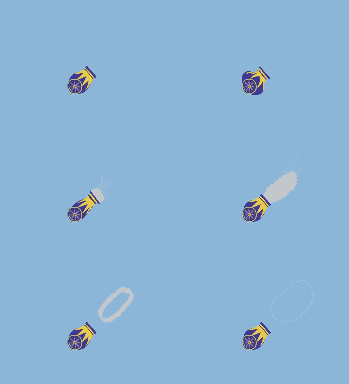
It also took us a few iterations to get the art and the animations just right, though we had a much clearer idea of what we wanted from the start than with other blocks.

original vs final shape and color

original vs final shape and color

from cartoonish smoke rings…

from cartoonish smoke rings…

… to a more sensible puff

… to a more sensible puff


While the cannon did end up requiring extra precautions and plenty of testing to make sure that it worked correctly with multiple players and projectiles, locally and online, we definitely don’t regret committing to that design after all. There’s a reason it’s a recurrent item in 2D platformers: it simply is fun! Once we tried it out, we knew it was worth putting in the work to do it right.

We were rewarded with a warm reception for this extravagant new block, which garnered tons of enthusiasm from Ultimate Chicken Horse fans. When A-cobra-tic came out, we saw many of you make entire levels based on this block alone, which is a true testament that it was worth all the trouble. This is the kind of thing that keeps us going, so we thank you for this show of appreciation!

Thank you for reading this behind-the-scenes article! If you liked it, you can check out the previous ones on the flamethrower block and Snake character; and you can look forward to next week’s exposé on the Space level.

Behind the scenes: Snake

This is part 2/7 of a series of articles written by Eve, the Clever Endeavour Community Manager, about the making of the A-cobra-tic Update for Ultimate Chicken Horse, which was released in March 2020. Each article will reveal some of the process of making new content for the game, and show in-progress images of each of the A-cobra-tic features that have never been shown to the public before.


The star of A-cobra-tic

As we’ve shown in the previous behind-the-scenes article about the flamethrower, we receive a ton of fan suggestions and concepts for things to add to Ultimate Chicken Horse. As much as possible, we keep notes on all of these ideas in a big master list, and through time similar ones tend to fuse together into concepts that are bigger than the sum of their parts. Then we look back at that list when we’re looking for inspiration for new features, and each item serves as a potential springboard for our imagination.

Most of the time when fans ask us if we took their suggestion for new content, the answer is both yes and no: their idea might have fed into this process, but no single person convinced us to make any particular feature.

The star of the A-cobra-tic Update, the new Snake character, is a major exception to that rule.

snake? snaaaaaaake!

snake? snaaaaaaake!


At the start of the first meeting we had about the update, in August 2019, we knew we wanted to add a new character, but we weren’t sure what. We pitched a few options to consider, and one that came to mind for me was this specific concept fan art we received from The Grand Tickler on Steam in October of 2018:

look familiar?

look familiar?


Fabio, who was going to take the lead on character art for this update, was instantly enamored with this design. As soon as the meeting ended, he hopped into his VR headset to paint the first bit of real concept art for the update in Quill.

and the masses said: “UCH in 3d when?”

and the masses said: “UCH in 3d when?”


He backed this concept with multiple reasons why a snake on a skateboard was a good design for a new Ultimate Chicken Horse character:

  • It is very distinct from previous characters

  • It is dynamic and cool, but also cute

  • It would be easy to animate - and fun to make!

From a technical perspective, this totally checked out, but I think that it was Fabio’s enthusiasm for Snake, and his excitement for animating it, that was the biggest factor in getting the whole team on board with it. As a bonus, we set a record time to finding the obligatory punny name for the update!

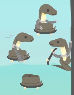
On the same afternoon, we already had concepts for the outfits and reskin.

this game of “spot the differences” is kind of easy

this game of “spot the differences” is kind of easy


The hoverboard would be a nod to Back to the Future, and it made sense to give an alternative look to Snake’s defining characteristic: the skateboard. The scarf would be a great item to bring some more dynamism to Snake’s movements, and the baseball hat… well, how else are you going to dress up an animal that has no limbs?

You’ll notice that there’s one thing from that proposal that ended up changing dramatically, and it’s the Worm reskin. Fabio actually got pretty far into repainting the Snake as Worm, so we have many “final” assets to show for it:

Yes, this worm has a tongue. please don’t revoke my biology major.

Yes, this worm has a tongue. please don’t revoke my biology major.


We liked the looks of it on the high-resolution sprites, but once we put the art in the game to test it, we came to the realization that the scale and resolution made this reskin look like nothing more than a beige Snake.

*squint*

*squint*


This brings us on a small detour to another behind-the-scenes anecdote, this time from the development of the Transformidable Update. We had started working on it in late 2018, right after publishing Ultimate Chicken Horse on Nintendo Switch along with the Chimply Amazing Update. It all began with Ben prototyping a whole collection of Modifiers. When that was well underway, we discussed what other fun and transformative content we could add to the update, and that’s how we came to decide to make reskins for all the characters already in the game, inspired by Horse’s Zebra costume. One of the first Transformidable reskins we developed was the Black Sheep. However, as development progressed and reskins for the other characters were drawn, we felt it just wasn’t distinct enough, and we pivoted to giving Sheep a Ram reskin instead.

it’s kinda cute…

it’s kinda cute…

… but this is more interesting

… but this is more interesting


To get back to our Snake, when we saw the relative blandness of the Worm reskin in the game, we were reminded of our commitment to make every animal’s reskin as unique-looking a character as is possible. Because of that, we got together to discuss what else could be a good secondary look for Snake.

Thankfully, we didn’t have to think about it for too long. Since we started working on this update and Fabio made the A-cobra-tic concept art, there was a recurring conversation in the team about whether the titular pun was justified enough if the lead character was not, in fact, a cobra. Most of us didn’t think it was a big deal, considering that we’d done that before with Monkey in Chimply Amazing. (Believe it or not though, we were actually called out for that by some fans on social media!) Fabio himself was very squarely in the camp to think that it made no difference what species of snake the character was. As it turns out, there’s a very simple reason why our Brazilian team member would think that…

ah-ah! moment

ah-ah! moment


Nevertheless, now that we were in need of a new design for the reskin, it felt quite natural for everyone to embrace the pun fully and agree to make a bona fide Cobra costume. The big difference between a snake and a cobra being the distinctive hood, this was a perfect way to give the reskin a unique silhouette.

fully kitted cobra

fully kitted cobra


This completes the story of how we took a fan’s concept for a character and made it the star of the A-cobra-tic Update for Ultimate Chicken Horse… sort of.

I’d be remiss if I didn’t mention that, on top of all the work that goes into nailing the art for a new character, there is another crucial component: the audio design. Snake just wouldn’t be the same without its voice, or without the extremely satisfying skateboard / hoverboard sound effects when you land and slide on things.

I can’t go into nearly as much detail for that though, because the folks at Vibe Avenue are entirely responsible for everything audio in the game. We show them the designs, and with a little bit of feedback from us, they produce all these truly fantastic sound effects. Their work is essential in making Ultimate Chicken Horse as enjoyable as it is, and we could never give them enough praise for it!

We hope you enjoyed this behind-the-scenes article! In case you missed it, you can also read the previous one about the flamethrower block. Next week’s article will be about another block, the cannon. See you then!