Behind the scenes: The Ballroom

This is part 6/7 of a series of articles written by Eve, the Clever Endeavour Community Manager, about the making of the A-cobra-tic Update for Ultimate Chicken Horse, which was released in March 2020. Each article reveals some of the process of making new content for the game, and shows in-progress images of each of the A-cobra-tic features that have never been shown to the public before.


Constructing The Ballroom

While some levels in Ultimate Chicken Horse can be adaptations of concepts or layouts that the player community can generate, like Space was, there’s a lot of value in introducing ideas and mechanics that are completely new to the game. However, there’s a delicate balance between novelty and things that will cause us major headaches to implement.

It’s already possible for players to make levels with multiple goals in the Free Play level editor, and we regularly see examples of that from the community. On the other hand, level makers are limited to one start zone per level. The idea of a level with multiple starts has interested us for some time, because without the constraints of the in-game editor, it was fairly easy for us to make, while potentially creating a new play experience unlike any of our previous levels.

‘Cosmic Rift a and B sides’ is an example of a custom level with two different goals (5FHR-7H34)

‘Cosmic Rift a and B sides’ is an example of a custom level with two different goals (5FHR-7H34)


With that in mind, we had no issue agreeing to prototype a level with alternating start zones. The challenge we immediately faced, though, was determining what would be an interesting layout and theme for such a level.

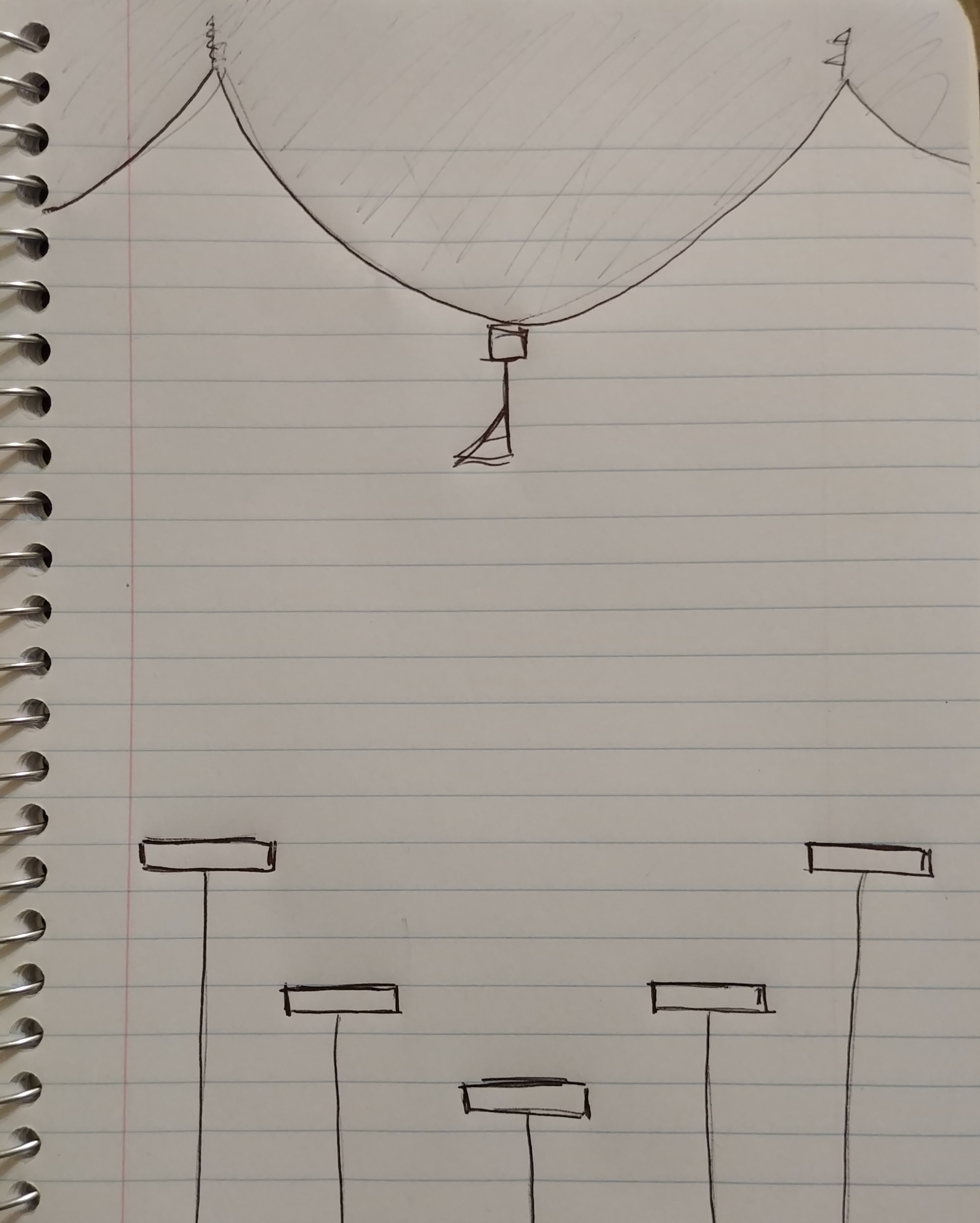
I pitched the first idea with a very crude drawing. I imagined a series of start zones in a semicircle, and a suspended goal at the top and center of the playing field. You can’t really tell with my lacking art skills, but the proposed theme was a circus tent, with spinning plates as starting platforms.

what matters is that it gets the point across, okay?

what matters is that it gets the point across, okay?

While there was nothing especially wrong with this layout design, our desire to make the Space level a vertical one with a flag at the top meant that this would have been too redundant.

Not fully knowing what direction we wanted to take for this second level, we decided to experiment a bit with different layouts to see what interesting play patterns could emerge by placing the start zones in various ways around the level. We built three different prototypes and playtested each of them.

prototype 1

prototype 1

In Prototype 1, we placed the platforms around a large object that segmented the playing field.

This would have been most interesting if going between starts 2 and 3 (faded arrows) was ever a viable strategy, but we found that this didn’t happen naturally. The result was that playing this level mostly felt like playing two separate courses (solid arrows), and they were each sparsely populated with blocks.

Prototype 2

Prototype 2

Prototype 2 took a completely different approach, with the three start zones in succession, meaning that players would pass through the same path every time, but start at various distances from the goal. 

We found that this created little incentive to place traps in the first two thirds of the level, and that meant each run through it felt like it wasn’t made so different by alternating the starting point.

prototype 3

prototype 3

Prototype 3 was the general layout we went with: the three start zones at the top, and the goal at the bottom center, with symmetrical platforms at mid-height to avoid creating very long blind falls.

This had the advantage of creating two main paths (red/pink and purple/green), which gradually converge as you get nearer to the goal. It balances the objective of creating a different experience depending on where you start, while avoiding to create fully independent and sparse roads that feel like they have no relation to each other. It’s also possible – and sometimes desirable – to build into the big open zones on either side of the level to form longer, alternate paths (blue arrows).

This design was originally inspired by the Plinko board, where you choose to drop a puck from any number of locations at the top, let it bounce down on pegs that determine its path, and hope it will land into a desirable bin at the bottom. We also looked at pachinko machines, which function in roughly the same way, but are visually much more interesting. However, we decided that it was better for us to move away from that aesthetic altogether, because it emphasizes aspects of lack of control and random chance. That is the antithesis of Ultimate Chicken Horse, which is at least in part intended as a show of skill and intentionally calculated risk.

Plinko from the price is right

Plinko from the price is right

a japanese pachinko machine

a japanese pachinko machine


We also toyed with the idea of not having all the players start in the same location every round and randomly spreading them out, but that would have gone against another core value of the game: fairness. The whole point is to make sure that when you make the level harder, it’s not only your opponents who suffer the consequences, but you too.

Moving away from Plinko and pachinko, we eventually settled on a classier theme for our alternating start platforms: we made them into crystal chandeliers suspended from the ceiling of a ballroom.

the ballroom as you know it

the ballroom as you know it


We also flipped the goal upside down so that players couldn’t just fall straight into it from the start zones. This made sure that playing this level felt like platforming your way to victory, and not just hitting bumps on a ballistic path downwards. It also incentivizes players to build around the common objective in the very first rounds before moving outward to fill the funneling paths with traps, which tends to make for the most interesting gameplay.

When you look at the final product, The Ballroom seems like a completely straightforward level. It might be surprising that it required so much thought and experimentation to get it right!

P.S. I’m glad that we ended up with the theme of The Ballroom, because it gave our musical friends at Vibe Avenue an opportunity to concoct yet another totally banging track, which turned out to be one of my favorites in the game so far!

If you liked this behind-the-scenes article, make sure to check out the previous ones about the flamethrower, Snake, the cannon, Space, and the one-way gate. You can also look forward to the last part of this series, which will be published next week and will cover the making of the beehive!

Spooky matters, the return of #AskClevEndeav, and UCH in a museum exhibit

Hello friends!

Here’s what’s up with us this month:

  • A call for YOUR spooky Ultimate Chicken Horse levels

  • The return of the #AskClevEndeav vlog series

  • Four more articles in the A-cobra-tic behind-the-scenes blog series

  • Ultimate Chicken Horse in the A+D Museum’s Designing Worlds virtual exhibit

  • The release of Lucifer Within Us by Kitfox Games

  • Sponsoring the upcoming GAMERella game jam

  • This month’s charity: the Montreal Children’s Hospital Foundation

Shall we?


In the UCHverse

Let’s start with the Ultimate Chicken Horse related news.

First, we’re looking for YOUR spooky custom levels! As we often like to do for Holidays, we want to feature a full page of themed user-made levels in Ultimate Chicken Horse at the end of the month, in time for Halloween. To do that, we need you to send us your level codes before October 30th on this Steam event or on our social media.

There’s only about a week left, so don’t waste time!

2020-10-21 Spooky levels.png


Next, after a long hiatus due to the destabilizing weirdness that is the year 2020, the #AskClevEndeav vlog series is back on our YouTube channel with a brand new episode! Rich and Fabio answered questions from our fans, like: What’s the worst block in UCH? What’s the link between Elephant and Jane Fonda?

Watch the video to hear what they had to say about that and much more!


If you like to know more about how Clever Endeavour works as a team, and more importantly how new content for Ultimate Chicken Horse gets made, then you might also want to check out our ongoing blog series which takes you behind the scenes of the A-cobra-tic Update.

Since last month, we published four new posts, covering the making of Snake, the cannon, Space, and the one-way gate. Go check them out to see concept art and abandoned designs!

2020-10-21 Snake Concept.gif


Finally, Ultimate Chicken Horse was included in the A+D Museum’s Designing Worlds virtual exhibit, in the Gameplay Mechanics section. The exhibit includes an exclusive video interview with Richard, where he talks about our wonderful community – that’s you!

2020-10-21 Designing Worlds.png


Industry happenings

Last week, our Montreal neighbors and studio besties at Kitfox Games released Lucifer Within Us, a game that mixes detective work and the occult. If solving murders and performing exorcisms sounds good to you, we suggest you check it out for a good October game night!

2020-10-21 Lucifer Within Us.gif


Also from our local scene, the Technoculture, Art and Game (TAG) lab is preparing this year’s edition of GAMERella, a game jam made for people who are often marginalized in game-related spaces. For the first time, this year the event is fully online and accessible to participants from all over the world! First-time game-makers are welcome – no experience required.

Clever Endeavour is happy to sponsor GAMERella for another year by providing swag for their goodie bags, and three of our team members will be available as mentors during the event.

2020-10-21 GAMERella 2.jpg


The GAMERella game jam will be held on November 14th-15th. You can sign up here for free. In addition to the main event, there will also be workshops in the weeks prior, which will introduce attendees to game-making tools such as Bitsy, Puzzlescript, Construct 3, and INK.

The charity corner

Last but not least, in the name of Clever Endeavour’s employee-led donation program, Alex chose to make a charitable contribution to the Montreal Children’s Hospital Foundation in the month of September. This will go towards research funding, giving medical and therapeutic care to sick children, and supporting their families.

Thank you for reading!

<3
The Clever Endeavour team

Behind the scenes: The one-way gate

This is part 5/7 of a series of articles written by Eve, the Clever Endeavour Community Manager, about the making of the A-cobra-tic Update for Ultimate Chicken Horse, which was released in March 2020. Each article reveals some of the process of making new content for the game, and shows in-progress images of each of the A-cobra-tic features that have never been shown to the public before.

Make way for the one-way gate

The first two blocks we designed for the A-cobra-tic Update were both intended to introduce more diagonal action to Ultimate Chicken Horse: the flamethrower and the cannon.

With the one-way gate, what we wanted to add was a block that could be used to force players to keep going down a certain path once they chose to enter it. We felt it had cool implications for puzzle-like challenge levels, which some of our fans really like to make and play.

One tactic to achieve that would have been to create a pair of items: a locked door block and a key pick-up. However, we also needed this new block to be interesting in regular Party mode, which is how most people play Ultimate Chicken Horse. We didn’t feel like a lock-and-key mechanism was the best choice for the kind of fast-paced action the game is best known for.

you know the kind.

you know the kind.


Instead, we figured our ideal one-way door would be like a miniature semi-solid platform. Since the release of Super Mario Maker 2 in June 2019, this had become a highly requested feature for Ultimate Chicken Horse; and we’re not above taking inspiration from the masters of platformer design at Nintendo.

When we thought about how to materialize this idea into a door-like block, the most obvious form that came to mind was a motion-activated door, which is an object most people have interacted with in real life, and is therefore easy to understand at a glance. If the block was going to be activated by motion, it came as a natural conclusion that it should also respond to moving projectiles if they entered its detection zone, and this was going to make it all the more interesting in Party mode. Just like that, we had a fairly complete mental image of what we wanted to make.

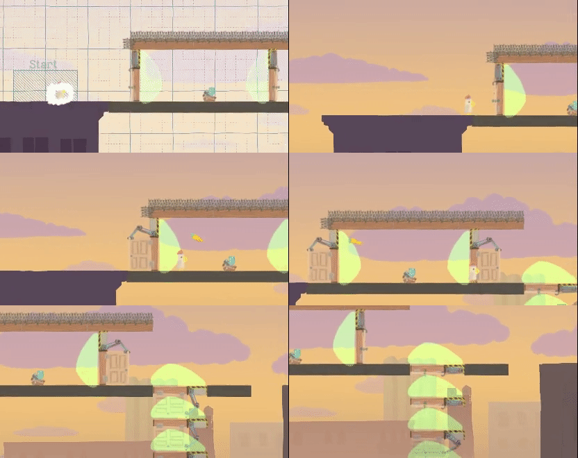
The first in-game prototype was literally just a copy of the existing door item, modified to open based on a motion detection trigger rather than being on an automatic timer.

programmer art is always a delight

programmer art is always a delight


Two main modifications were made to the one-way door’s core functionality since this first version. One is the speed at which the door closes after a trigger leaves its detection zone: it needed to be much faster to make the door work as a semisolid platform when it’s placed horizontally facing down.

only “solid” as long as it’s not activated to open again!

only “solid” as long as it’s not activated to open again!


The second change was to make the motion detector into a proximity sensor instead. As we increased the responsiveness of the door by making it close faster once it stopped being activated, the block’s behaviour started feeling a lot less intuitive than we’d hoped. We realized that this issue could be solved by making it respond not to motion, like real life automatic doors do, but rather to the simple presence of a character or projectile in its detection zone.

this just didn’t seem right!

this just didn’t seem right!


While the functionality of the one-way door was a closed case after mere days, the visual design of it took us more time to pin down. Originally, we thought it should be a 1x5 block, which would be similar to the scaffold when open. We also imagined it as a door opening from the center, and took inspiration from a discarded jetpack dispenser animation Fabio made when we were developing content for the Transformidable Update.

There were some issues with this design. First, we realized that the solid piece at the bottom would prevent placing the door on the ground in a way that would allow players to just run through it without jumping. This could be fixed by removing that part of the block, and changing the animation to make the door telescope shut instead, morphing it into something like a garage door. However, this created a new problem: the block stopped looking like anything recognizable once it was in its open state.

scaffold

scaffold

discarded jetpack dispenser design

discarded jetpack dispenser design

1x5 one-way door design

1x5 one-way door design

1x4 one-way door design

1x4 one-way door design


There was one more issue with the original design: it just looked… ominous.

i made this gif to express my feelings to the team about this design

i made this gif to express my feelings to the team about this design


The block thus went back to the drawing board, and was redesigned to instead look like a traffic gate, with the red and green lights indicating both the area of effect of the trigger zone, and the state of the block (opening or closing).

the final result

the final result


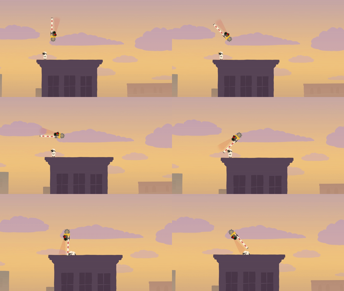
You might think the visual design was our final concern with the one-way gate, but as it turns out, it also required a ton of mechanical tweaking, on account of the fact that it just kept being extremely lethal, against all reasonable expectations.

2019-10-21 OWG death.gif
2019-11-21 OWG death again.gif
2019-12-10 OWG death redux.gif


Don’t be fooled by the fact that all of the above footage is in exactly the same location on Rooftops — it actually represents a span of 3 months of development and multiple tweaks to the gate’s hitboxes, because its lethality kept creeping back in new scenarios.

For this reason and other such technical oddities, the unassuming one-way gate is the block that had the most bugs filed in our bug tracker for the A-cobra-tic Update!

Thank you for reading this behind-the-scenes article! If you liked it, maybe you want to check out the previous ones on the flamethrower, Snake, the cannon, and Space. Stay tuned for next week’s article, which will cover the making of The Ballroom!