Behind the scenes: The one-way gate
/This is part 5/7 of a series of articles written by Eve, the Clever Endeavour Community Manager, about the making of the A-cobra-tic Update for Ultimate Chicken Horse, which was released in March 2020. Each article reveals some of the process of making new content for the game, and shows in-progress images of each of the A-cobra-tic features that have never been shown to the public before.
Make way for the one-way gate
The first two blocks we designed for the A-cobra-tic Update were both intended to introduce more diagonal action to Ultimate Chicken Horse: the flamethrower and the cannon.
With the one-way gate, what we wanted to add was a block that could be used to force players to keep going down a certain path once they chose to enter it. We felt it had cool implications for puzzle-like challenge levels, which some of our fans really like to make and play.
One tactic to achieve that would have been to create a pair of items: a locked door block and a key pick-up. However, we also needed this new block to be interesting in regular Party mode, which is how most people play Ultimate Chicken Horse. We didn’t feel like a lock-and-key mechanism was the best choice for the kind of fast-paced action the game is best known for.
you know the kind.
Instead, we figured our ideal one-way door would be like a miniature semi-solid platform. Since the release of Super Mario Maker 2 in June 2019, this had become a highly requested feature for Ultimate Chicken Horse; and we’re not above taking inspiration from the masters of platformer design at Nintendo.
When we thought about how to materialize this idea into a door-like block, the most obvious form that came to mind was a motion-activated door, which is an object most people have interacted with in real life, and is therefore easy to understand at a glance. If the block was going to be activated by motion, it came as a natural conclusion that it should also respond to moving projectiles if they entered its detection zone, and this was going to make it all the more interesting in Party mode. Just like that, we had a fairly complete mental image of what we wanted to make.
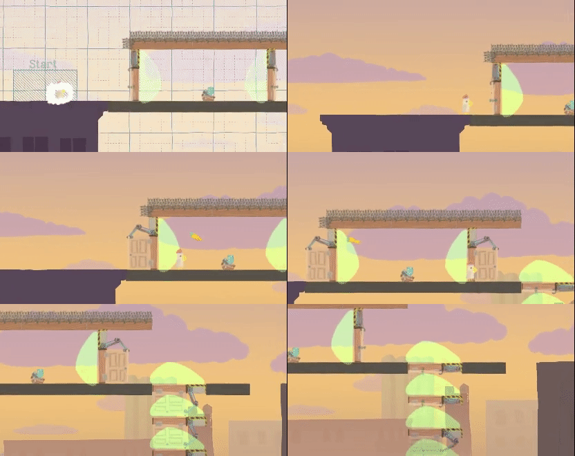
The first in-game prototype was literally just a copy of the existing door item, modified to open based on a motion detection trigger rather than being on an automatic timer.
programmer art is always a delight
Two main modifications were made to the one-way door’s core functionality since this first version. One is the speed at which the door closes after a trigger leaves its detection zone: it needed to be much faster to make the door work as a semisolid platform when it’s placed horizontally facing down.
only “solid” as long as it’s not activated to open again!
The second change was to make the motion detector into a proximity sensor instead. As we increased the responsiveness of the door by making it close faster once it stopped being activated, the block’s behaviour started feeling a lot less intuitive than we’d hoped. We realized that this issue could be solved by making it respond not to motion, like real life automatic doors do, but rather to the simple presence of a character or projectile in its detection zone.
this just didn’t seem right!
While the functionality of the one-way door was a closed case after mere days, the visual design of it took us more time to pin down. Originally, we thought it should be a 1x5 block, which would be similar to the scaffold when open. We also imagined it as a door opening from the center, and took inspiration from a discarded jetpack dispenser animation Fabio made when we were developing content for the Transformidable Update.
There were some issues with this design. First, we realized that the solid piece at the bottom would prevent placing the door on the ground in a way that would allow players to just run through it without jumping. This could be fixed by removing that part of the block, and changing the animation to make the door telescope shut instead, morphing it into something like a garage door. However, this created a new problem: the block stopped looking like anything recognizable once it was in its open state.
scaffold
discarded jetpack dispenser design
1x5 one-way door design
1x4 one-way door design
There was one more issue with the original design: it just looked… ominous.
i made this gif to express my feelings to the team about this design
The block thus went back to the drawing board, and was redesigned to instead look like a traffic gate, with the red and green lights indicating both the area of effect of the trigger zone, and the state of the block (opening or closing).
the final result
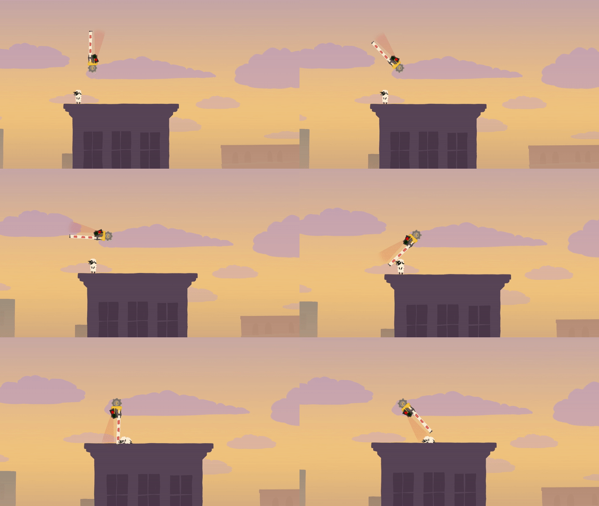
You might think the visual design was our final concern with the one-way gate, but as it turns out, it also required a ton of mechanical tweaking, on account of the fact that it just kept being extremely lethal, against all reasonable expectations.
Don’t be fooled by the fact that all of the above footage is in exactly the same location on Rooftops — it actually represents a span of 3 months of development and multiple tweaks to the gate’s hitboxes, because its lethality kept creeping back in new scenarios.
For this reason and other such technical oddities, the unassuming one-way gate is the block that had the most bugs filed in our bug tracker for the A-cobra-tic Update!
Thank you for reading this behind-the-scenes article! If you liked it, maybe you want to check out the previous ones on the flamethrower, Snake, the cannon, and Space. Stay tuned for next week’s article, which will cover the making of The Ballroom!


