Behind the scenes: The beehive

This is the final article in a 7-part series written by Eve, the Clever Endeavour Community Manager, about the making of the A-cobra-tic Update for Ultimate Chicken Horse, which was released in March 2020. Each article reveals some of the process of making new content for the game, and shows in-progress images of each of the A-cobra-tic features that have never been shown to the public before.

Not the bees!

The beehive as a new block for the A-cobra-tic Update kind of snuck up on us.

At our first meeting about the update, we all agreed to make 3 blocks, and the favored ideas were unanimous. Though their design changed with iteration, we knew we were setting out to make a set of blocks with certain features, and those became the flamethrower, cannon, and one-way gate.

At our second meeting, we mostly discussed the design of those blocks, but Alex also pitched this new idea of a beehive and bees chasing players. As he put it, the concept was basically to introduce the Move or Die mechanic to Ultimate Chicken Horse, by adding something that would create a momentary pressure to keep moving forward no matter what, without any chance to pause and think.

this game also has a chicken in it!

this game also has a chicken in it!


The team was immediately enthusiastic about the idea of murderous bees. Who wouldn’t be? Therefore, we left the meeting knowing that we would prototype four blocks for the update, rather than three, as we initially intended. (This is what is known as scope creep, by the way.)

Art-wise, there were few iterations from the original placeholder image to the final design of the beehive:

placeholder

placeholder

first concept art

first concept art

final art

final art


Small tangent to avoid the ire of bee enthusiasts and to educate those who aren’t apiculturally inclined: this kind of artistic representation, which everyone thinks of as a beehive, is in fact more akin to a bee skep. Natural beehives only look like semi-amorphous blobs of honeycombs, usually covered in buzzing bees. Bee skeps are bell-shaped straw baskets that people used for beekeeping before square apiary boxes became the norm, and though they are rarely used nowadays, their appearance has shaped people’s collective imaginary for beehives in a pretty permanent manner.

a beehive, without the usual swarm of bees

a beehive, without the usual swarm of bees

ye olde bee skep

ye olde bee skep


Moving on to the bees themselves, the first “programmer art” version of them was simply a cloud of flies, taken from the Zombie Modifier animation, duplicated and rotated to look like a swarm. While we usually hand animate pretty much everything in Ultimate Chicken Horse, this placeholder helped us see that a different solution involving procedurally animated bee particles would be preferable, so that’s what Kyler set out to do. It’s hard to illustrate the details of that process, but it involved coming up with semi-random movement algorithms to create a visual effect that’s reminiscent of the organized chaos of bug swarms.

At the same time as artists were refining the bees’ look throughout development, programmers ran into a number of bugs (hehehe) to iron out with things like pathing, as shown below.

typical #gamedev stuff

typical #gamedev stuff


On top of artistic considerations and programming issues, we also kept facing new design questions to answer about the desired bee-haviour (sorry). For example: Should Ghosts be able to activate them? (We decided that they should, on account of the fact that it would be hilariously chaotic to allow players to torture each other from beyond the grave that way.)

One design question we pondered for a long time was whether bees should return to their hive after a kill, making the beehive possible to activate once more by a new victim. We experimented a bit with this, and saw two problems. First, we felt it was difficult to visually communicate the difference between hazardous bees targeting a player, and inoffensive bees making their way back home. When bees dispersed back to their origin, they definitely looked like they were a danger, yet we didn’t want them to be. Second, it wasn’t fully evident when was the exact moment that all bees had returned to their hive, and the beehive could be activated again.

bees returning to their hive after a kill

bees returning to their hive after a kill


Aside from those concerns, we also realized that it could actually be more interesting for beehives to be activated only once. If a beehive is placed where all players have to pass to reach the goal, they make it riskier to try and get First points. Similarly, bees can guard a coin, and selectively force players who get greedy to be on their toes. These kinds of things can help even out the playing field, by making that one platformer deity in your friend group face greater challenge in their quest to score a victory. For all these reasons, we ultimately decided to make bees fade away after successfully killing their target.

RIP

RIP


Like always, the final piece of the puzzle for this block was to have Vibe Avenue make the sound effects to go with it. There is nothing like the noisy buzzing of a swarm of bees chasing you to instill a real sense of urgency!

In addition to the sounds you hear during gameplay, every single block in Ultimate Chicken Horse also needs a number of audio effects in the user interface: for example, when you hover over it before selecting it in the Party Box or Inventory. These often aren’t noticed so much, but they can go a long way to make the game feel more responsive and alive. The beehive placement sound effect has become my favorite example of that. The fact that you hear a tiny “bzzbzz!” every time you place down a beehive simply makes me want to use that block more!


Of all the blocks in the A-cobra-tic Update, the beehive came with the biggest design challenges and demanded the most work. In the end though, we regret nothing about somewhat spontaneously deciding to add it to Ultimate Chicken Horse. We think it’s one of the most interesting blocks in the game yet, and our players’ positive reaction to it easily justifies our perseverance.

Thank you for reading this behind-the-scenes series! If you missed any of them, please also check out the articles on the flamethrower, Snake, the cannon, Space, the one-way gate, and The Ballroom.

Rich's Thoughts from PAX East 2019

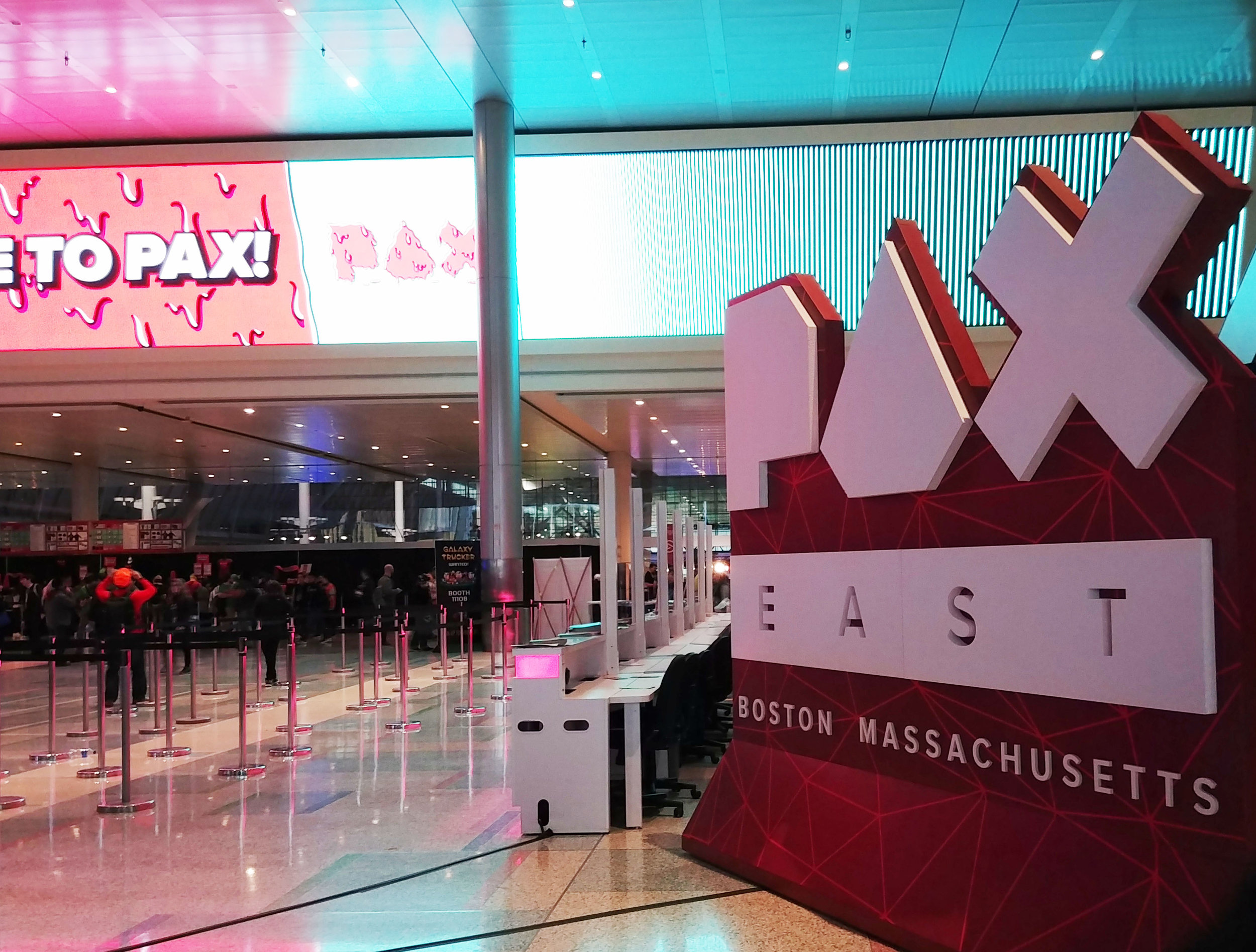
This blog post was written by Rich, the only member of Clever Endeavour who was at PAX East. The opinions in the post don’t reflect the opinions of the entire team, only of him!

Hi there!

Last week, I went to the massive game Expo PAX East, in Boston. I went partially to see what’s going on in the industry, see what trends I could find, and keep up contact with some developers our team knows. It was nice to see the progress that some games have made since last year, and see some new creative ideas spawning from both experienced and new developers. I’ll talk about some things I noticed, then a few games that I’d like to highlight. There were around 40 games that I had already seen, so even though they may be great I’m not going to mention them here!

Overall I did see some trends, both positive and negative, that I’d like to discuss here. First, the positive.

I found the quality of games and the polish level to be much higher than it was last year at PAX East. A lot of games had impressive looking art that was either really well executed or really creative as far as art direction goes. Lastly, there were some more party-style games that I would put in the same realm as Ultimate Chicken Horse, which I think could do well. It was surprising to me that in the last year or two, there haven’t been many stand-out party games that performed as well as games like Move or Die, Duck Game, StickFight, and Ultimate Chicken Horse. I think that trend has changed, and two of the games I’ll highlight are proof of that.

I had some criticism of what I saw to share as well. Most importantly, I found that a lot of games could have used more critical analysis early on. The execution might be there, but there’s nothing about the game that shows me that it should ever have been made in the first place. What makes it interesting or different? Why would I want to play it at all? In my opinion, some of these games should have been killed early on in their development, and yet will go on to spend 2 years of development money and inevitably flop from a financial perspective, despite being good games. The trick then is finding the great idea and executing well, and it’s a very hard thing to do (and I’m not saying our studio necessarily knows how to do this reliably). The execution without the creativity can sometimes lead to games that perform decently, but won’t truly excel unless the execution makes the game the best in its genre in the last few years. The creativity without the execution won’t work either, as the game will fail if the feel isn’t there.

I also noticed that a ton of games use pixel art, and while in some cases that’s clearly the best choice for the aesthetic, it seems like in other cases it was simply “the thing to do for an indie game”. As someone who loves pixel art graphics (Dead Cells ftw) I still found that a lot of games blended into each other in my mind because of their use of this style.

Okay, on to a few exciting things I saw!

Fling to the Finish - SplitSide Games

This co-op racing game has two players sharing a controller, and each controlling one round character attached by a string to their partner. The players can fling themselves and control their movement, but they pull the other along with them, so it takes serious teamwork. I see a lot of potential for this game if the online play becomes tight and if the game is interesting online while playing solo vs friends, for YouTuber purposes.

One Step From Eden - Thomas Moon Kang

This game calls itself “a deckbuilding roguelike with relentless real-time grid combat”. I didn’t get a chance to play but I watched a bunch and was really interested in it. I didn’t catch the “roguelike” part of it, but I understood that you move your character on a grid to fight using abilities that you draw from a deck. I really liked the look and the gameplay seemed tight and deep, despite the fact that it was a bit hard to understand when looking at it quickly from afar.

Killer Queen Black - LiquitBit

This competitive team-based game is about defeating the other by one of three methods: kill their queen, gather berries, or ride a snail to your finishing flag. It made me think a bit of Awesomenauts in how a team needs to participate and contribute in different ways to their team’s goal, but it had a shorter play time and I felt it was easier to understand. I could really see this working if the balance is right, as it offers and almost MOBA experience in a small, presentable package (disclaimer: I don’t play MOBAs so I’m not sure how accurate that is).

Sayonara Wild Hearts - Simogo

This self-proclaimed pop album video game is a blaze of colours and movement, with a flow unlike any game I’ve seen in a while. I actually found their reveal trailer to not be very representative of the game, though I understand they were trying to showcase the artists who make the music for the game (I think). The game takes you through a series of somewhat easy movement challenges and quick-time events, as you basically play your way through a neon music video, and it feels great.

That’s all for my thoughts about PAX, hope you enjoyed it if you were there, and I’m excited for you to play some of the great things that I saw if you couldn’t make it.

Cheers!
Rich

Geneviève's Thoughts from E3

In this second part of our blog post about E3, Geneviève talks about the most interesting things she saw, and recaps the highlights from the show. Our first part of this included Rich's thoughts, which you can read about here.

Geneviève E3 Thoughts

PC Gaming Show

The indies really shone during the presentation by PC Gamer, which is always a hopeful thing to witness. Also, I couldn’t help but notice all of the Community Managers representing their game on stage. Maybe one day…

Here are thoughts on some of the games shown:

Satisfactory, which seems to play somewhat like No Man’s Factorio, wins the prize for best game name.

There seems to be a new genre in indies: taxi driver games. Between Neo Cab’s futuristic dystopian Uber vibes, and Night Call’s Noir fiction atmosphere, the future promises opportunities to nosily explore the lives of passengers while trying to solve a greater mystery. The idea of using fleeting social encounters to paint a bigger picture certainly sounds interesting.

Untitled Publisher appeared and introduced three eye-catching games. Bravery Network looks like a Cartoon Network fighter and… smoocher? Morning Star cleverly taps into everyone’s play-farming desires before lifting the curtain and offering something much, much bleaker. Finally, Overwhelm (which is out now!) looks like a stylish and juicy pixel art shooter metroidvania. That string of words is music to my ears.

The game I am by far the most excited for in the PC lineup is Sable, an absolutely breath-taking exploration game with an underused graphic novel art style. Just upload my soul straight into this game, please and thank you.

On the other hand, my favorite segment was when they showed Two Point Hospital. A completely bonkers game and some brilliantly handled technical difficulties came together to create an adorkable presentation. This is exactly why the PC Gaming Show is my favorite every year since its inception: the vibe is gleefully casual and wholesome, in no small part thanks to Sean “day[9]” Plott who is crazily charming as a presenter and totally an inspiration for me as a public figure in games.

Other highlights: Jurassic World Evolution’s trailer was narrated by Jeff Goldblum (yaass); Stormland looks gorgeous but is a VR game (boo); Klei is being delightful as ever with their upcoming expansion Don’t Starve: Hamlet; the ambitious Noita is a procedurally-generated rogue-like where each individual pixel responds to physical events (!); Ooblets looks ever so jolly but gameplay remains a mystery; and finally Maneater had the best trailer and I won’t say more because you should just watch it.

Others

EA simultaneously announced and released Unravel Two, a magical-looking co-op (or solo) sequel to the game that charmed us with its adorable yarn character on a mission. Their other game that caught my eye was Sea of Solitude, which seems both vibrant and gloomy and has got me under its spell.

Microsoft showed gameplay footage of Ori and the Will of the Wisps, which somehow looks even prettier and more endearing than the first game.

Sony went all out with the queer in their trailer for The Last of Us Part II, and if you hadn’t heard this already, I’m not sure how you managed that. In any case, it was a beautiful trailer for sure, and the contrast between Ellie’s normal romantic teenage life moment and her fighting in a post-pandemic world was striking to say the least. I wonder how (or if) that will translate in the actual game.

Ubisoft’s trailer for Beyond Good and Evil 2 was also cinematically pretty awesome, with an exciting reveal of Jade’s presence in the game, which fueled both my excitement at the promise of this prequel and my anticipation about whether it’ll feel anything like the original.

Of course we were also treated to more cinematic footage for Kojima’s unquestionably unique brain-child Death Stranding. It’s starting to make more sense, but also, kind of not? The very first shot of the trailer might encapsulate my feelings at this point most aptly. (Look it up, you won't be disappointed.)

One thing I did not see coming was Captain Spirit, a standalone game in the Life is Strange universe about an imaginative young boy, as well as my strong interest for it. I haven’t engaged with the LiS games at all, but there’s something about the magic of childhood imagination that looks so beautifully captured that I want to experience it.

In the midst of their totally unhinged “fake” conference, Devolver Digital announced My Friend Pedro, a tactical shooter platformer where you embody a character who is just as graceful as he is badass. Ballet, gunfights, and skateboards? I’m in.

Finally, Nintendo’s e-presentation showed the same kind of restraint we’ve come to expect from them in terms of announcements about their franchises. In short, the trailer for Mario Party showed some interesting use of the Switch’s touch screen, other party games like the indies Killer Queen Black and Overcooked 2 (which has online multiplayer!) are also coming to the console, and the Super Smash Bros. Ultimate announcement alone took up over 20 minutes of air time, which was interesting but a little weird.

--

That's all for our E3 talk, hope you enjoyed, and look forward to another blog post soon!